
- Dec 2, 2022
- 5 min read
Updated: Jun 7
Project Summary
Role: Creative Direction · Brand Identity · Marketing Design · Event Promotion · Art Direction (Book Cover) · Community Engagement
Location: Oklahoma, USA
Context: Independent campaign for debut memoir published by Yorkshire Publishing Group (Tulsa, OK)
Partnership: Stand for the Silent – National Anti-Bullying Organization
Tagline: Designing hope through storytelling.
I Have A Reason — launched as my debut memoir. An autobiographical story about neurodiversity and resilience — spread through a unified strategy of social storytelling and live events.
Without a marketing department or paid media support, I independently directed every phase of the campaign: visual identity, event planning, PR outreach, and brand partnerships. The result was a grassroots effort that blended digital storytelling, community connection, and cause-based collaboration into a single, cohesive identity.
The goal wasn’t just to promote a book — it was to build a movement.


Before designing promotional materials, I began by defining the visual foundation — the book itself.
Book Cover Art Direction
Before marketing began, I developed the creative direction for the book cover. My early sketches and Photoshop experimentation explored symbolism through visual metaphors — an empty desk surrounded by objects from the story, and later, paint splatter textures representing artistic expression within autism.
After refining these ideas, I chose a cleaner and more universal approach: a classroom desk wrapped by puzzle pieces, symbolizing the complexities and beauty of the autistic experience. The blue color palette reflected both the traditional color associated with autism awareness and my personal connection to the subject.
Yorkshire Publishing finalized the layout and compositing under my creative direction — following my visual brief, layout sketches, and symbolic guidelines. The final design reflects my emphasis on clarity and symbolism: simple, human, and deeply personal.
Pre-Launch Strategy
Promotion began more than a year before the book’s release — not with ads, but with authentic conversation.
It started with a Facebook post asking former teachers for story ideas to include in the book. The positive response rekindled connections with mentors who would later become advocates for the project.
Months later, I reintroduced the book through the viral #10YearChallenge trend, juxtaposing an old basketball photo from 2012 with a new photo taken in the same gym. The caption reflected on bullying, resilience, and personal growth.

The emotional honesty of that post built momentum and curiosity about the upcoming memoir. Over the following months, I maintained interest through subtle, purposeful updates — including a Father’s Day tribute post about my grandfather (featured in the book’s dedication) and an announcement of my publishing deal that tagged contributors who helped shape the project.
That approach created emotional investment. My audience felt ownership in the project long before its release — a strategic form of organic community-building.
Challenge
This campaign began with no established audience, ad budget, or agency. Every piece of design and outreach had to establish credibility, emotion, and consistency from scratch.
To succeed, it had to:
Feel authentic and mission-driven rather than self-promotional.
Visually align with Stand for the Silent®’s anti-bullying advocacy.
Seamlessly link digital momentum with local, in-person connection.
With those challenges defined, I built a campaign identity that blended professional consistency with personal honesty — one that could live equally well online, in print, and in person.
Design Strategy
The campaign identity centered on bright blue — the signature color of Stand for the Silent® — symbolizing empathy, courage, and unity.
Typography paired a modern serif for clarity with a handwritten accent for humanity.
Paper textures and print overlays grounded the digital materials in authenticity, connecting visual design to the memoir’s themes of honesty and reflection.
Design became the language of sincerity — bold enough to stand out, soft enough to connect.
It also allowed me to expand into motion design, creating animated promotional pieces that extended the campaign’s reach.
For another motion-graphic example, view my Night Racers teaser, produced in Adobe After Effects.
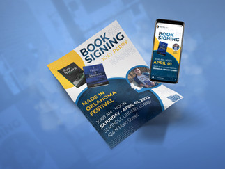
Launch Planning & Execution
After confirming a release date with Yorkshire Publishing Group, I secured a venue partnership with Farmer’s Daughter Market in Tecumseh, OK, which hosted the event in exchange for social media visibility.
When Kirk Smalley, founder of Stand for the Silent®, confirmed participation, I planned the campaign rollout: an unboxing teaser video, a Facebook event page, and a Countywide & Sun newspaper feature timed to maximize visibility.
I distributed flyers and posters personally across local businesses, achieving 90% participation.
During the event, I delegated responsibilities — my grandmother handled cash transactions and my sister assisted with setup — allowing me to focus entirely on audience engagement.
Every decision aimed to make the event feel relational, not transactional.


The launch party exceeded expectations, selling out within an hour.
Event photographers Grace Warren and Kalie Yeager captured the energy, crowd interaction, and emotional tone of the launch, giving the campaign its visual heartbeat.
Media Coverage
Coverage from The Countywide & Sun and The Seminole Producer amplified visibility, with coordinated sharing on Facebook during the same week.


I commented personally on every share of the newspaper article — a simple gesture that built deeper community ties.
Landing Page
To support the book’s release, I developed a dedicated landing page at JoeyPerryArts.com/reason, designed to capture reader interest and convert curiosity into engagement. The URL appeared prominently on promotional bookmarks, posters, and event materials distributed during launch week.

The page featured a clean layout optimized for mobile and desktop, a short synopsis, a testimonial quote, and a contact-form opt-in that offered readers a free downloadable first-chapter PDF. Each submission fed directly into my campaign mailing list for personalized follow-up and event updates.
This digital component helped transform a traditional book launch into a measurable awareness campaign.
Post-Launch Momentum
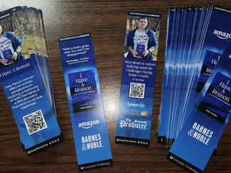
After launch week, I kept engagement steady by sharing early reader testimonials and featuring them in new bookmark designs — doubling their purpose as both marketing tools and keepsakes.
One of those early reviews came from Kirk Smalley, founder of Stand For The Silent®, whose words became a core testimonial across later materials.

Book Signing Events
As the campaign expanded, I began scheduling in-person signings and community events to keep the book visible in local circles.

Speaking Engagements
Following the book’s release, the campaign naturally evolved into live presentations focused on empathy, bullying prevention, and autism awareness.
These events transformed the book’s message from print to personal connection — allowing students to see how creative storytelling and resilience intersect.

Tecumseh High School
I was invited to speak at Tecumseh High School’s Youth Alive service after my book’s release gained local attention. The session combined storytelling, faith, and mental health advocacy.
We talked about purpose — how even when you don’t understand your pain yet, your story might be the reason someone else doesn’t give up.


Attendance was approximately 50 students and faculty.
Dale Public Schools
I was invited to speak to approximately 180 elementary students for Autism Awareness Week.
The presentation focused on understanding autistic peers, embracing neurodiversity, and a live Q&A followed.


Results
Through design, community strategy, and storytelling, the I Have A Reason campaign reached hundreds of readers, students, and educators — without relying on external marketing agencies.
Each creative decision was guided by the mission to reframe autism not as a limitation, but as a perspective — and to prove that empathy, design, and storytelling can coexist as tools for change.


This campaign taught me how design thinking applies beyond visuals — to people, timing, and story. It proved that the most meaningful design work begins long before a logo, and lasts long after the event.
Where to Find It
Following its release, I Have A Reason was made available on both Amazon and Barnes & Noble’s online storefronts. While Barnes & Noble later retired the listing, I remain proud to have had my book featured on their platform during its initial launch year.
Today, I Have A Reason is Available on Amazon.


Comments